SGang Gwaay


Process:
-
![]()
geographic & cultural Research
Initial research on the place and people to get a sense of what a meaningful and accurate branding system would be
-
![]()
Haida Totums
deeper research on the architecture, art, and purpose around totems on the island
-
![]()
Haida art & design
Haida people have their own unique visual language, meaning, and motifs.
-
![]()
Local signage & type
Research on local signage revealed mainly sans serif, sharp, and clean typography.
-
![]()
Brand identity goals
After leaning about the peoples and the place, I created a list of values and related concepts to guide me in communicating relevant themes and stories
-
![]()
Robert Davidson Inspiration
Robert Davidson, a Haida and Tlingit contemporary artist. His work was greatly influential for my thinking on how to create a design system and logo that is referential to Haida design and modern design.
-
![]()
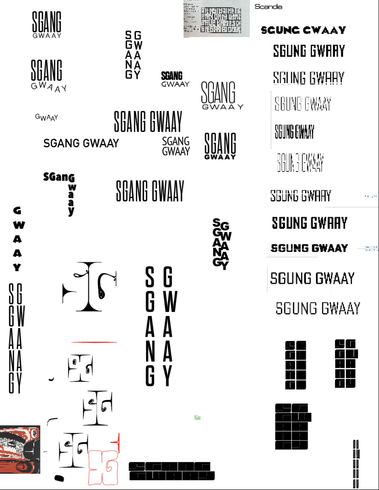
Type research
I began exploring various type faces as well as layout. Using the text to nod to totems was my main direction.
-
![]()
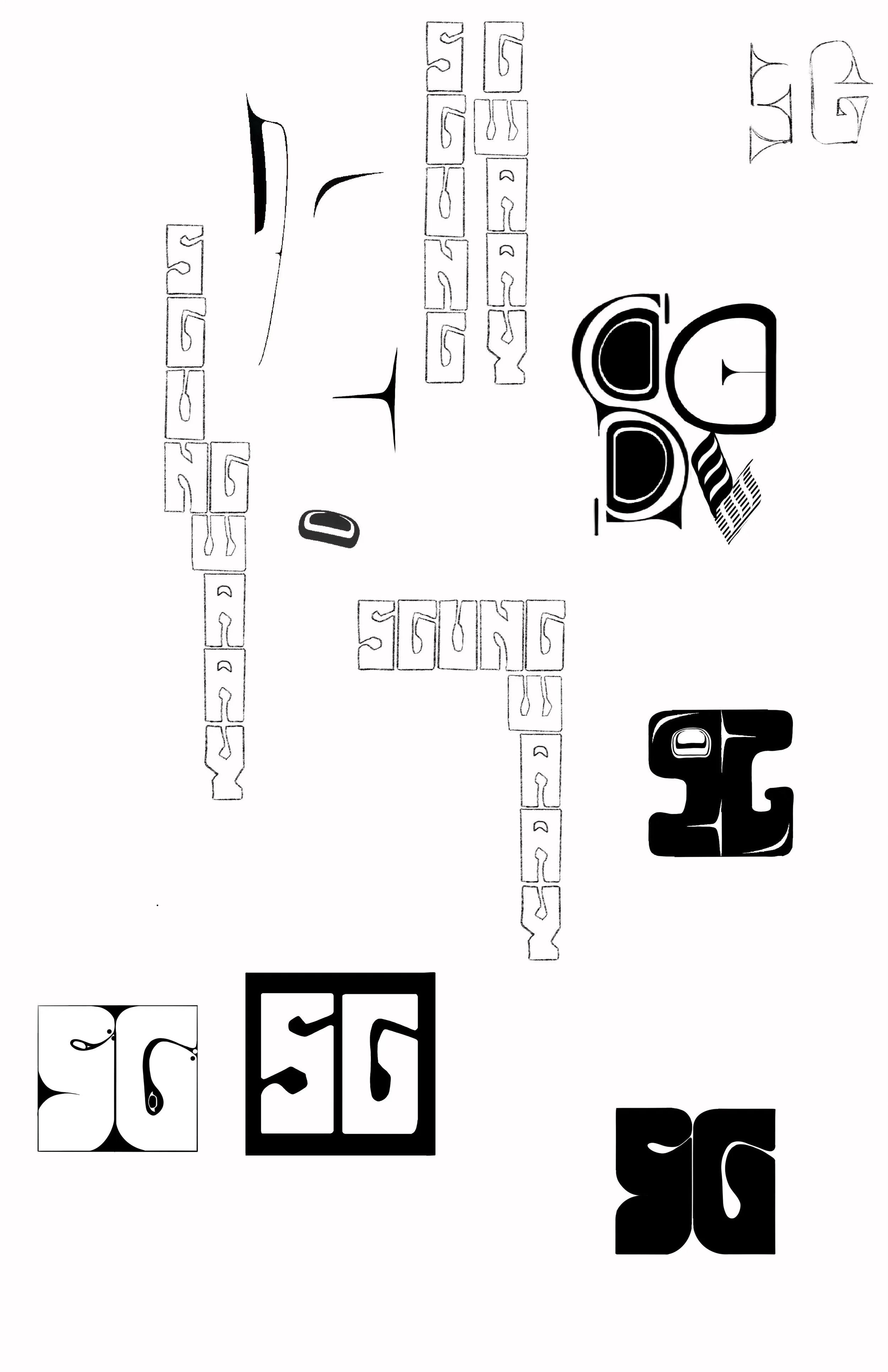
Honing in on type
In addition to the totem concept, I explored how to create letters using the Haida visual langauge
-
![]()
design iteration
Exploring difference settings and ways of utilizing the logo
-
![]()
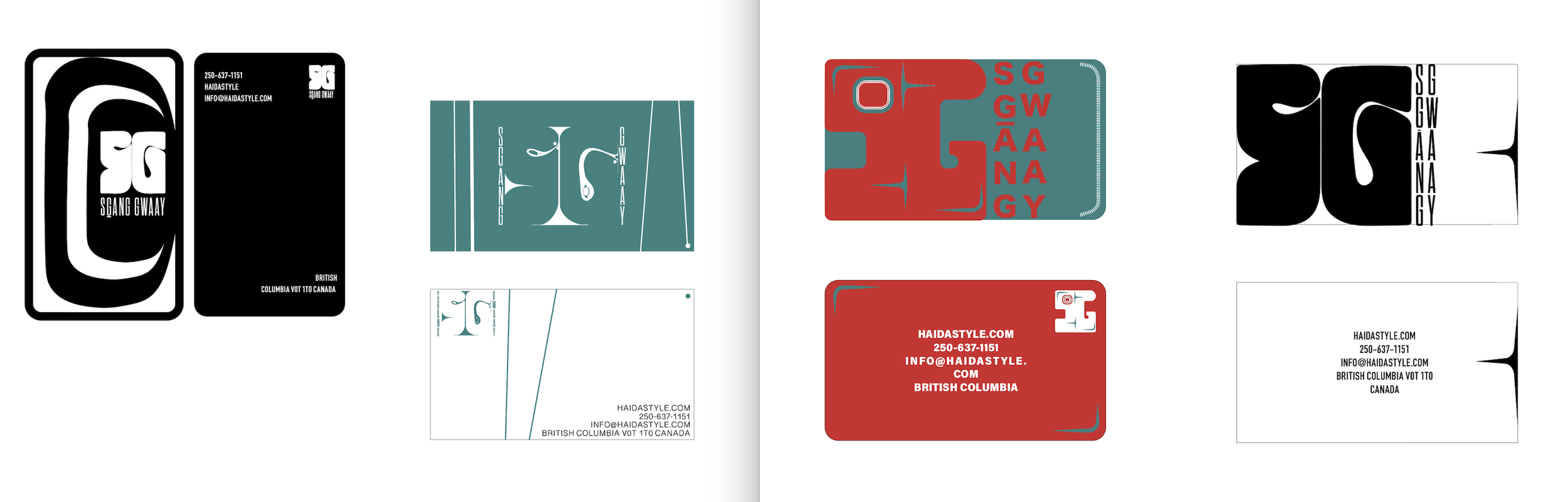
Final
The final branding system is seen above. Subtle references to the totems, to the design language, and overall creating a clean, earthy, sovereign branding system.