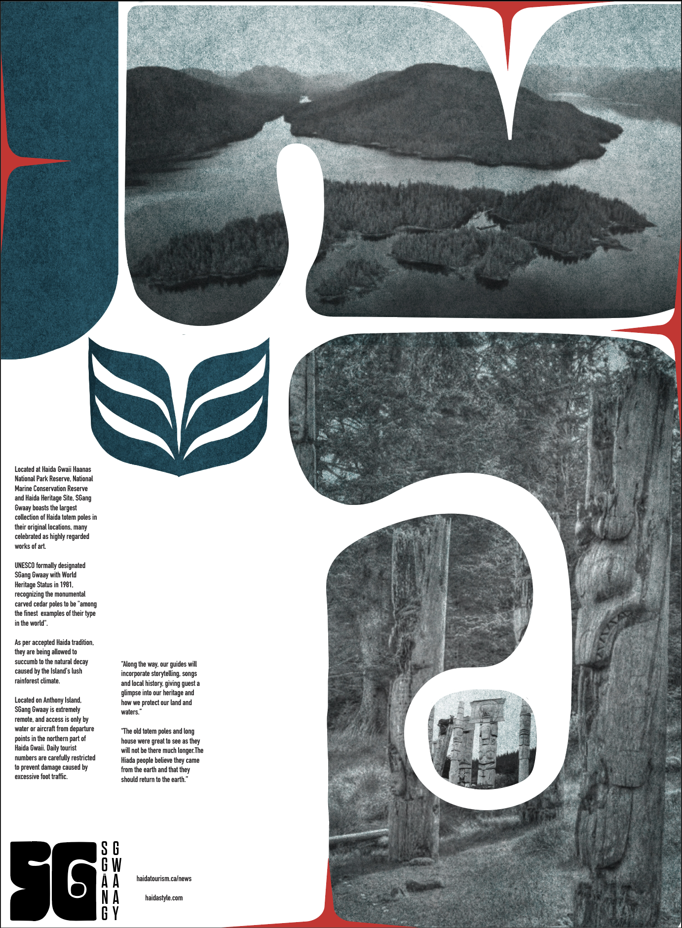
BRANDING PROCRESS: VISITING SGANG GWAAY
In 2023 I practiced building a brand identity for the UNESCO World Heritage Site SGang Gwaay. This island off the coast of Canada is under Haida sovereignty, an indigenous people known for their artistry and craft. My goal was to create a cohesive visual system which could be repeated and recognizable in various medias and formats, relating back to Haida culture, virtues, the environment of SGang Gwaay, and the Haida artistic language.
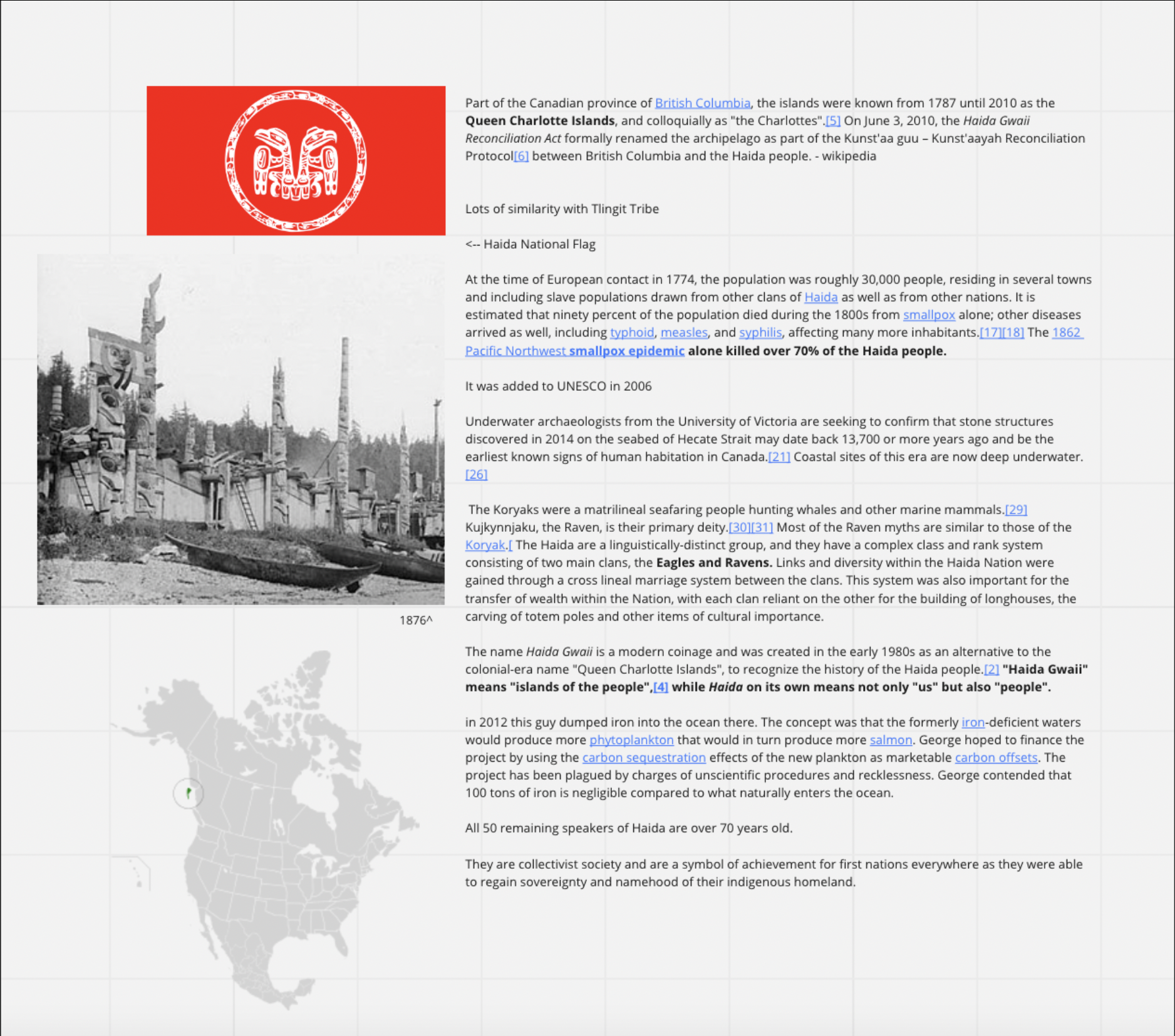
I began with researching the islands, Haida Gwaii, and the Haida people.
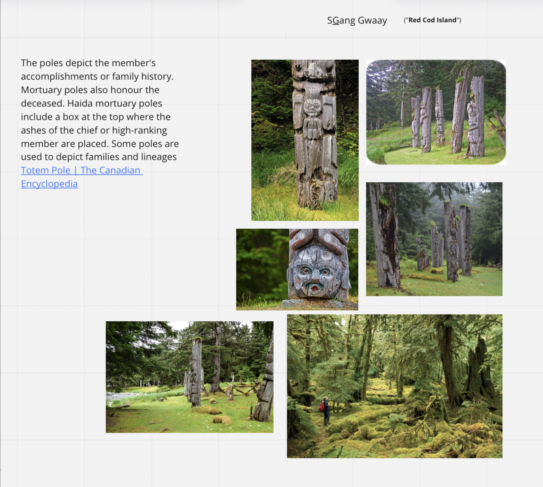
SGung Gwaay is knonw for the intricate totem poles in the forrest and by the water. These display Haida craftsmanship and their ancestral lineages and spirituality.
The Totems naturally decay over time which is part of Haida virtues: all things must return to nature.
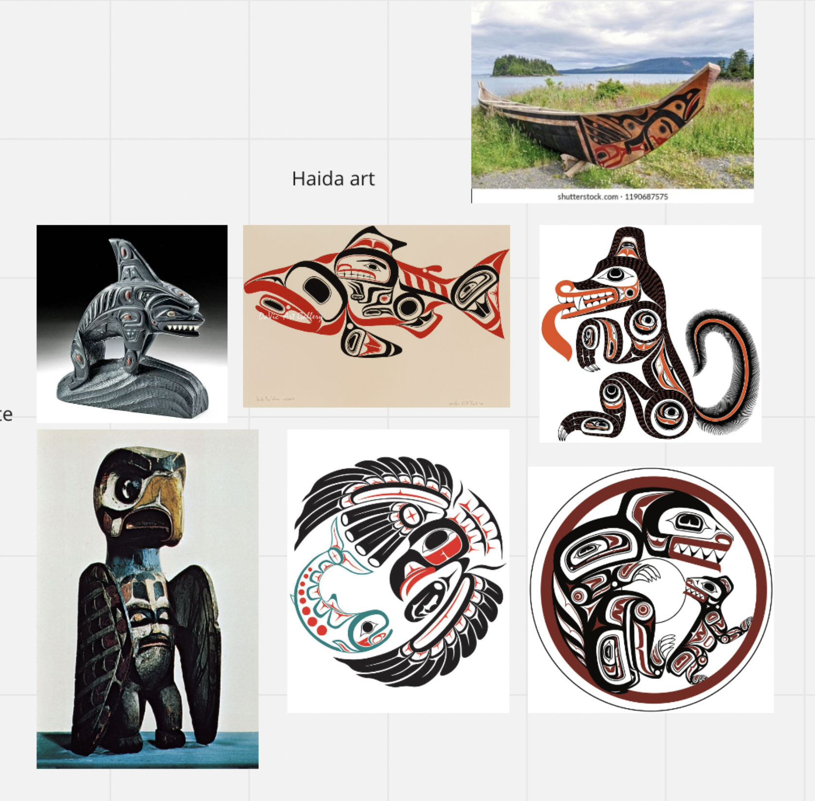
In my research I learned about Haida art.
They use repeating patterns, black, red, and turquoise, and add eyes, usually illustrating local fauna, often with spiritual significance.
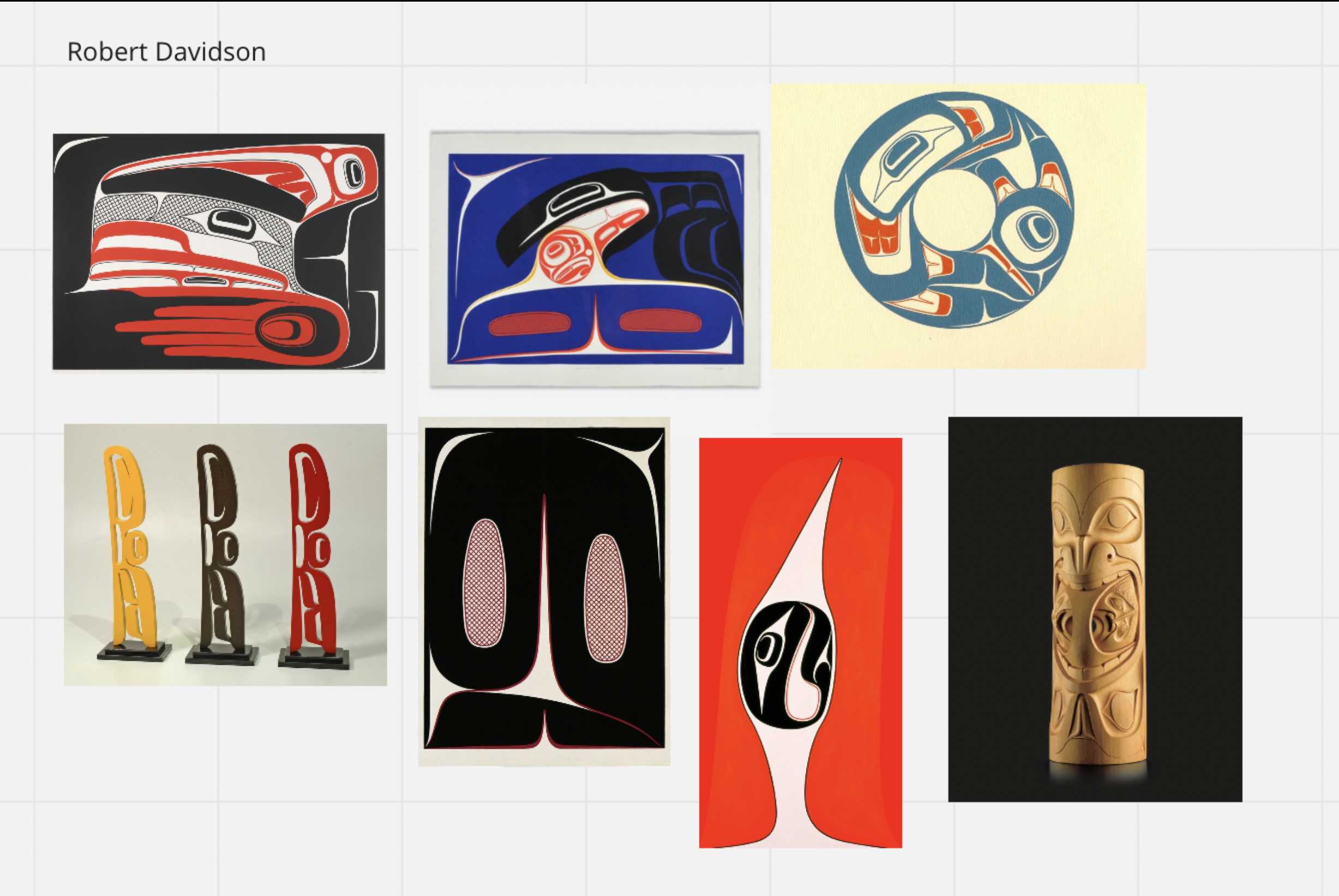
Robert Davidson, a Haida and Tlingit contemporary artist, uses indigenous symbols in a more abstract way. His work was greatly influential for my thinking on how to create a design system and logo for my project; how it speaks to something modern/midcentury, and to a specific tradition/culture and space.
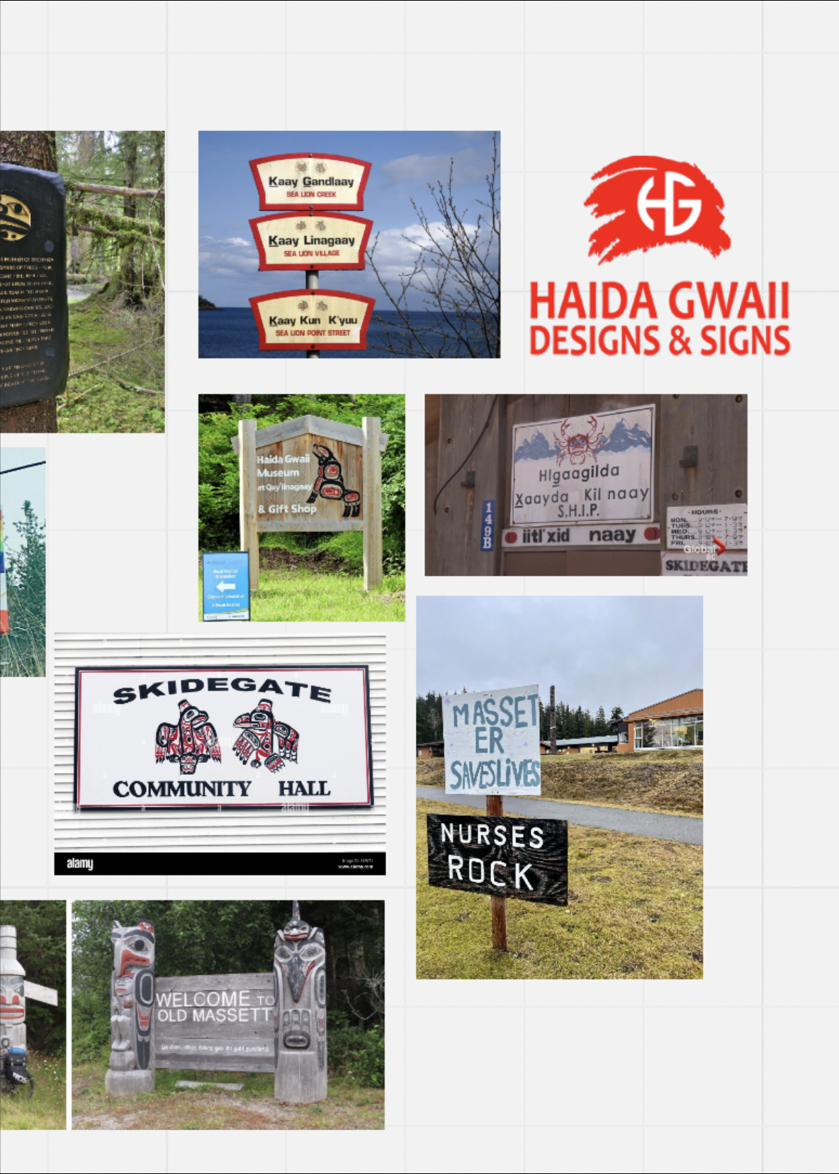
I looked into local signage and the Haida language to see if there was an identity to be found typographically. I noticed most of the signage was sans serif, often with a curved edge.
After my research, I created a list of words that would be the conceptual underpinning to the design. This way I could refer back to the meaning I am aiming to communicate when debating visual decisions. Some words included “sovereignty, forestry, artistry, animals, and respect…”
I then looked into many different fonts and faces, experimenting with different conceptual directions and visual voices.
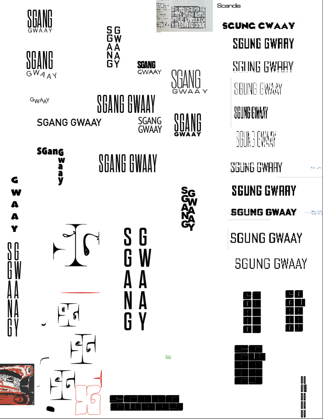
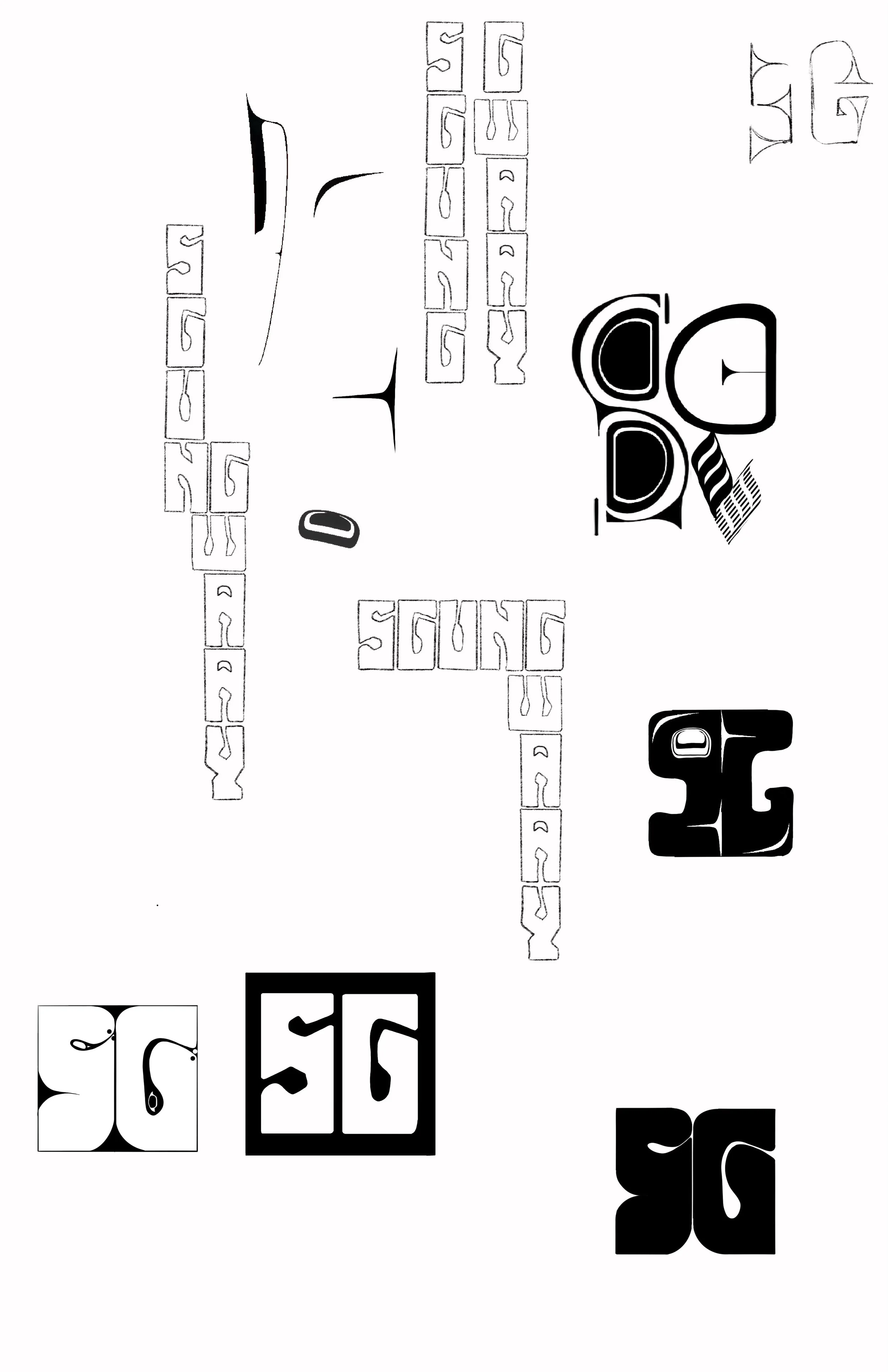
I began creating my own word marks, Inspired by a 70’s font that reminded me of the totem poles/wood carving. I also wanting to integrate some of the iconic Haida symbols and patterns.
The monograms at the bottom were speaking to me the most:
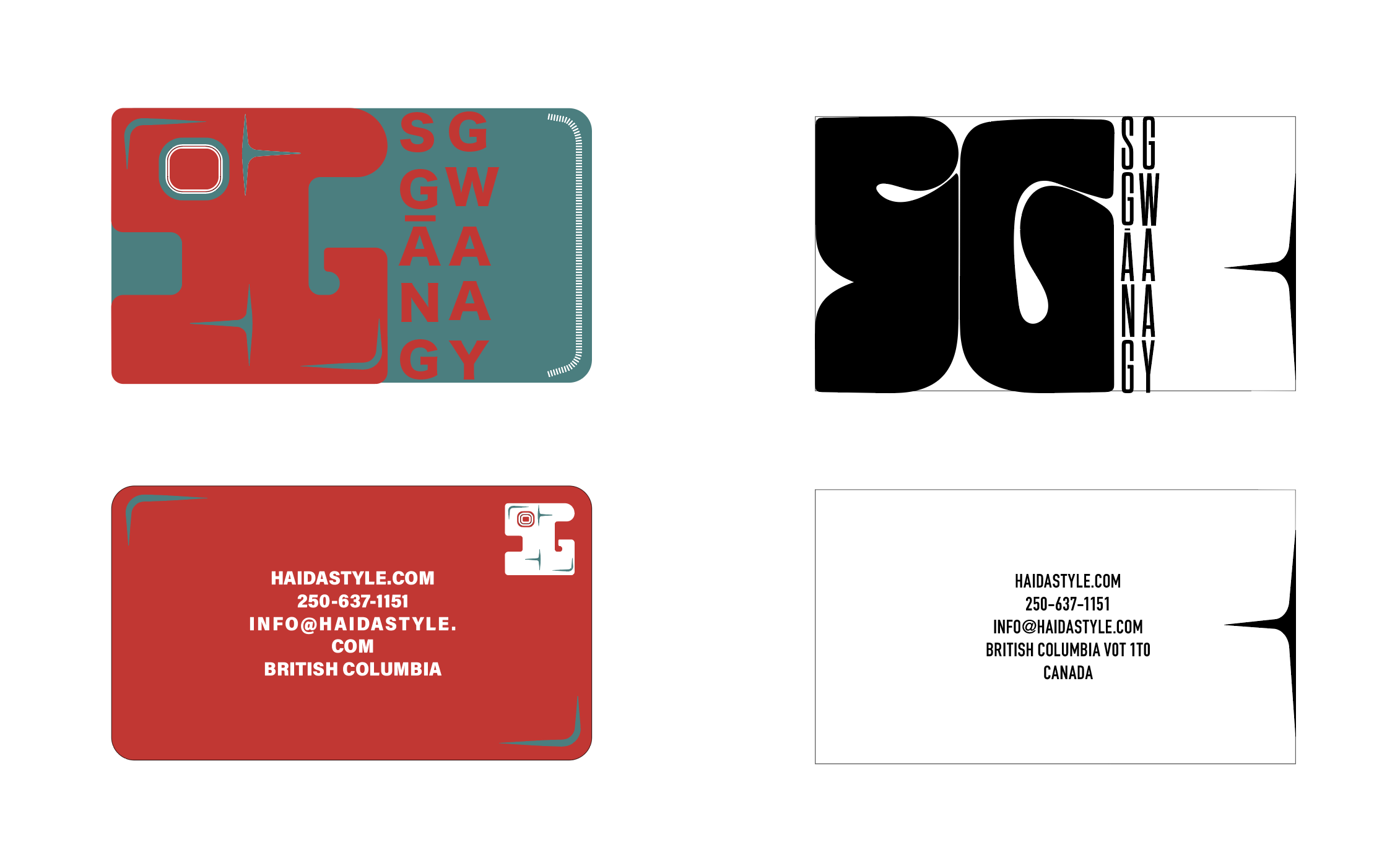
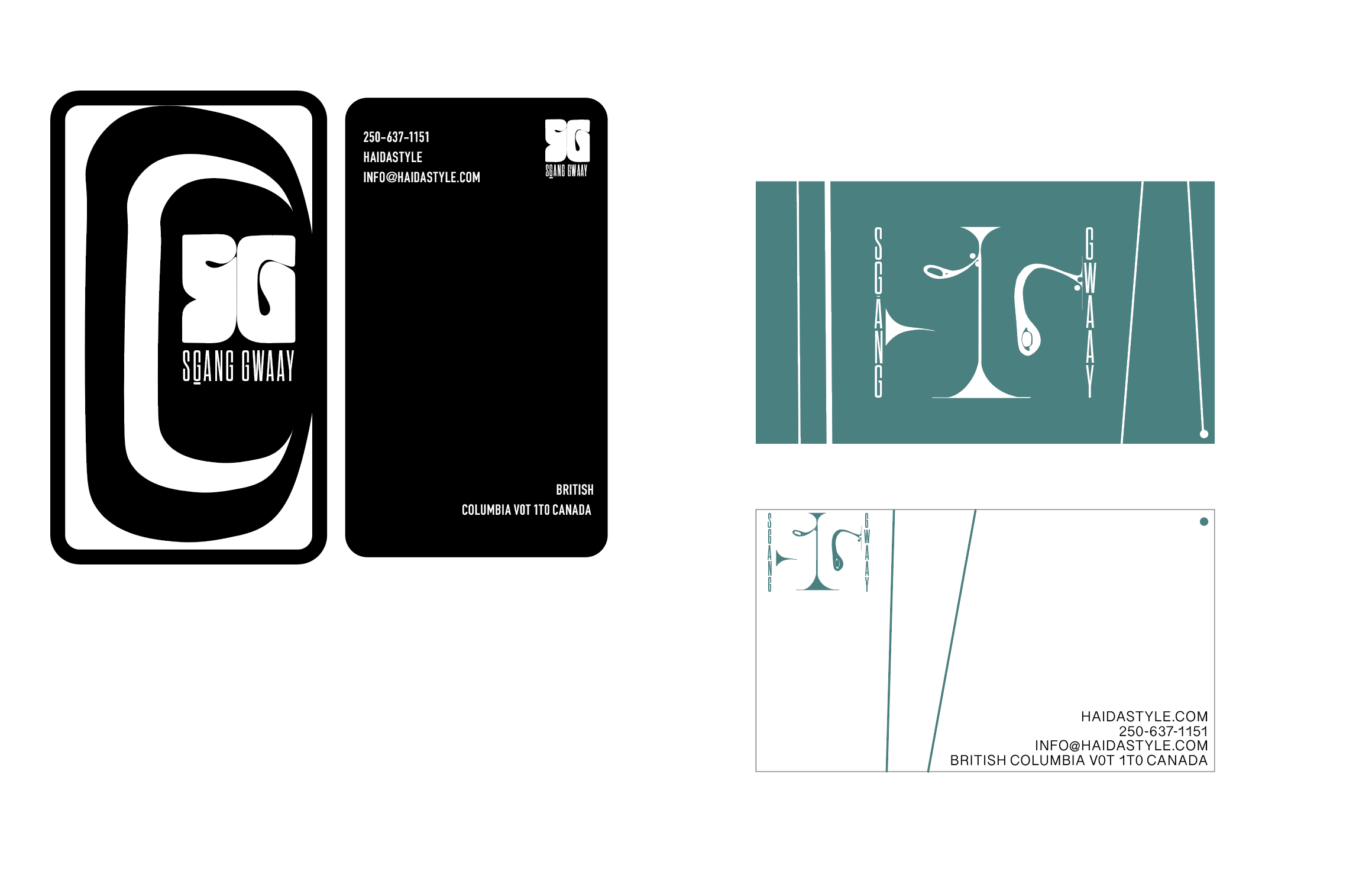
I then began mocking up business cards...
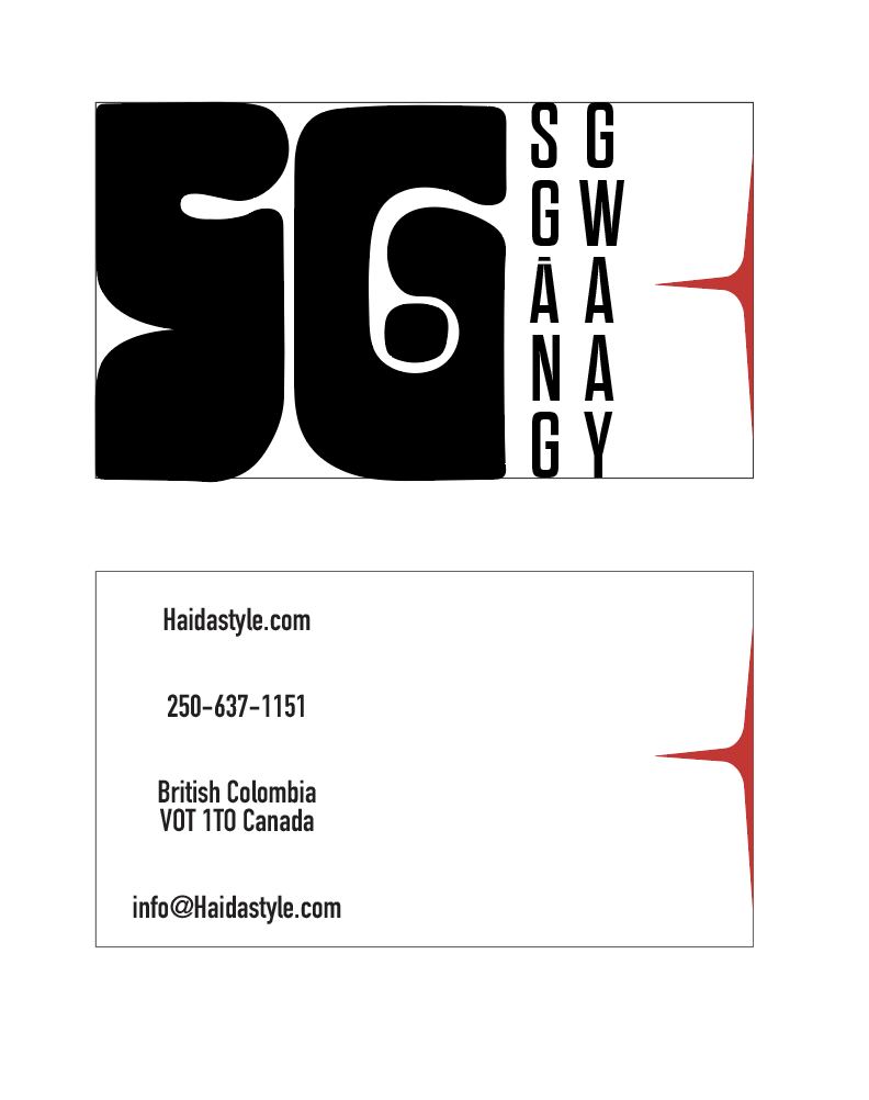
I decided on this:
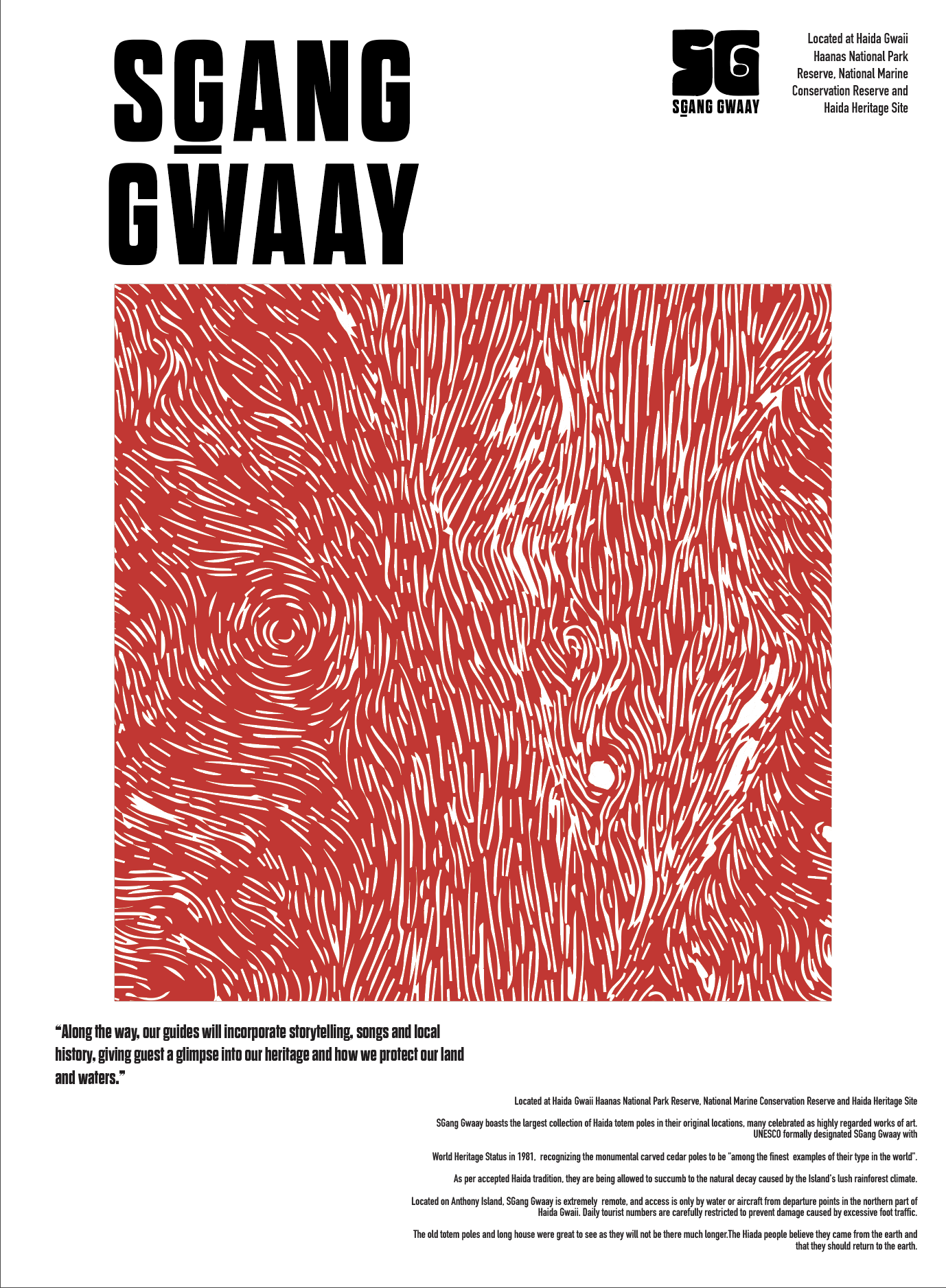
I made quick iterations of posters as well:
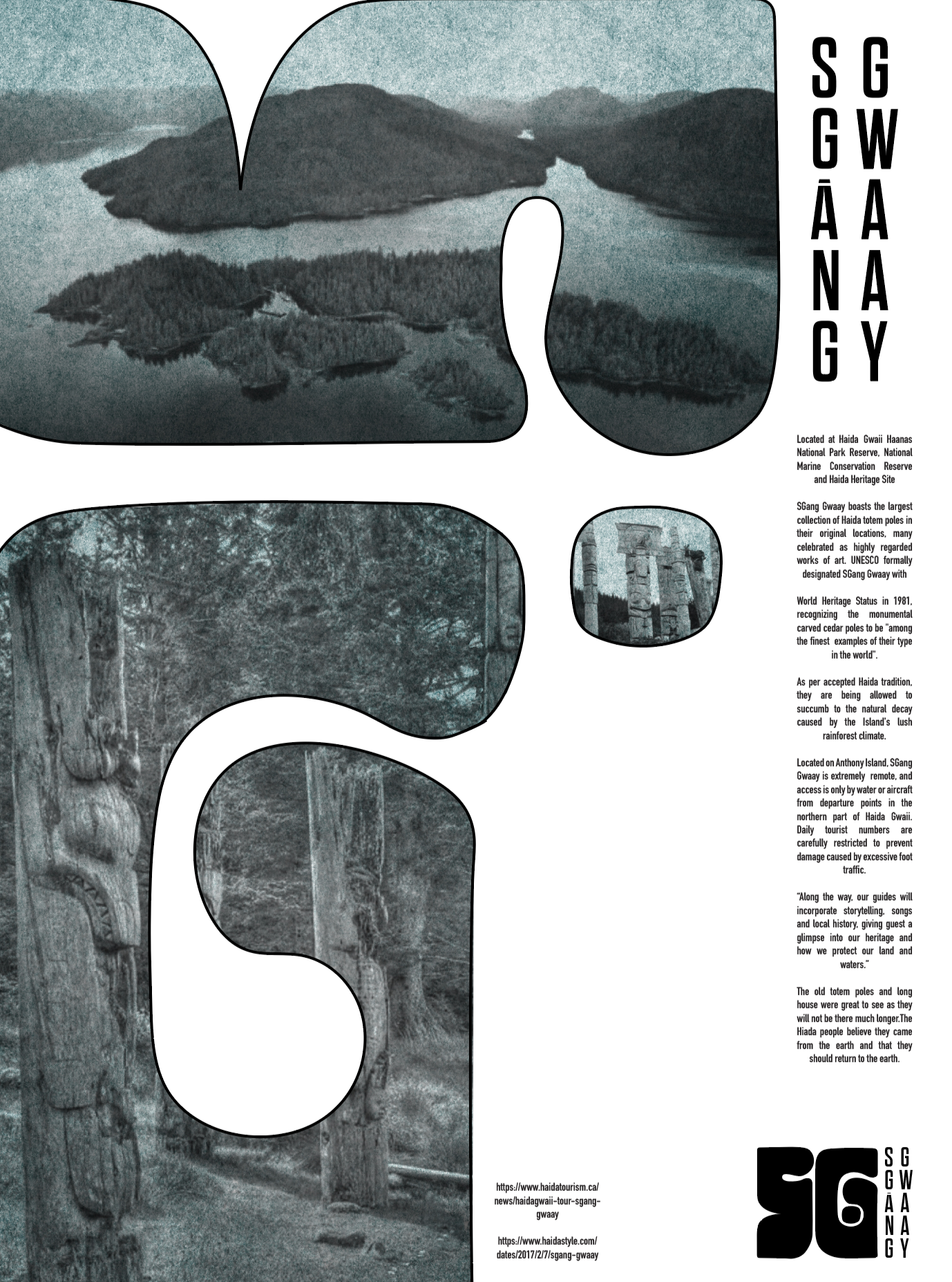
In the end, the design system can be explained as this:
Text alignment should reference the stacking of the totems. Image treatment should feel pulpy and warn, referencing the natural decaying process of the totems. Colors are ___ inspired by traditional Haida art. Negative space should reference Haida art and design patterns as well. Illustrations should only be used as decoration, as to not reference exact Haida images nor create a new illustrative style. Photos should be of nature or community in action, not posed or individual. Images/text should hold authority on the page without being too cold or harsh. The brand should have a natural, warm, and strong voice.