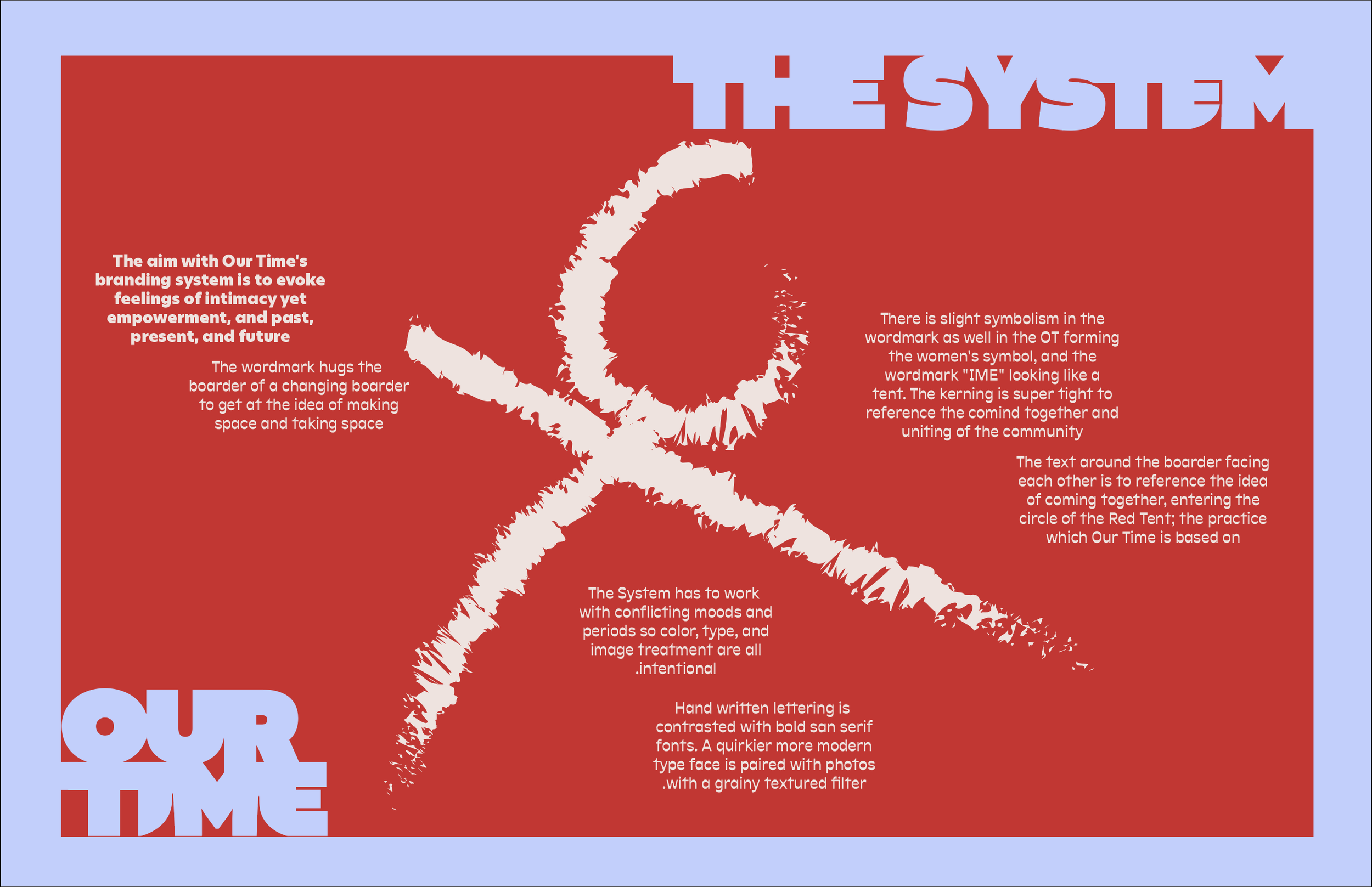
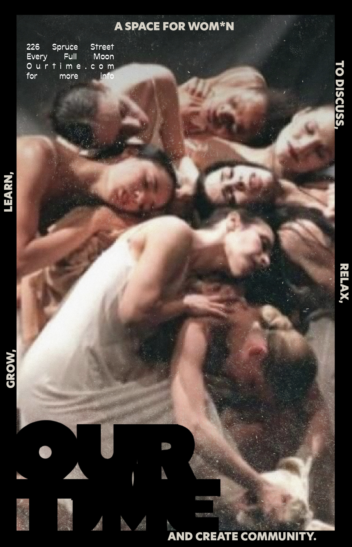
I created branding for a mock event called “Our Time”
I was inspired by the tradition of the “red tent” or menstrual huts performed in many different cultures. This is the practice of separating people from society during menstruation. This has caused many issues historically and presently. However, in some indigenous cultures on Turtle Island, these retreats are an honor. I also find power in this concept. Being secluded with other womxn is an opportunity to grow, unite, and share information to make us more sensitive (aware) and empowered. After all, the “feminine” power is through interdependency and cooperation.
The idea is that Our Time would host events every full moon for womxn to share meals, art, ideas, experiences etc. together and motivate each other personally and politically.
My aim with the branding was to feel warm and inclusive, but politically empowering. I researched the type and signage previous waves of feminism and began iterating on names and wordmarks.

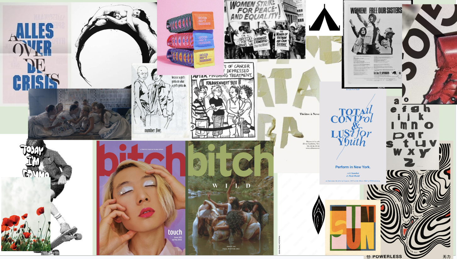
I did competitive research: exploring the visual culture around events like this that already exist, feminist magazines, and contemporary branding geared towards the target audience. As well as general typographic and design exploration.
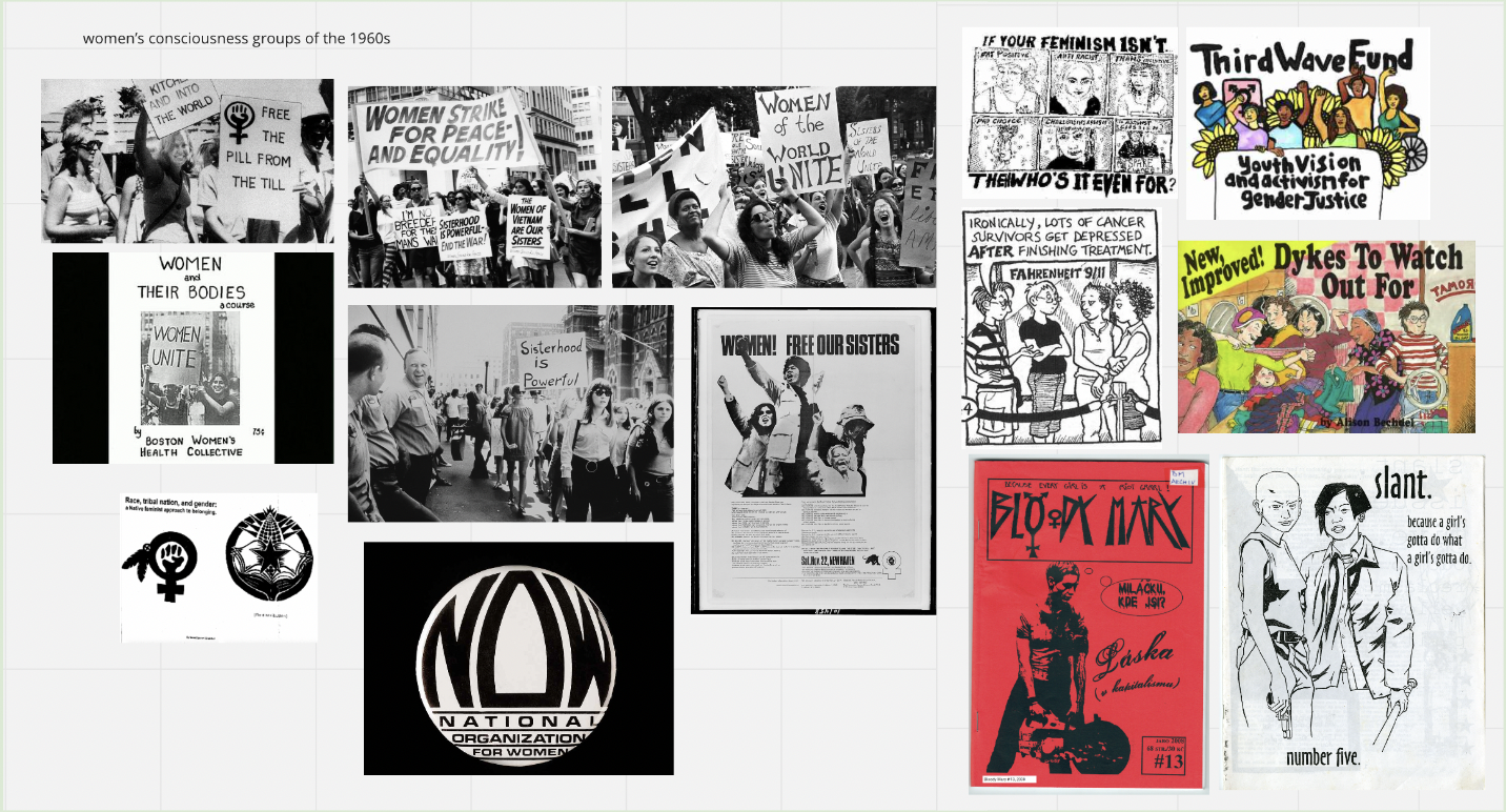
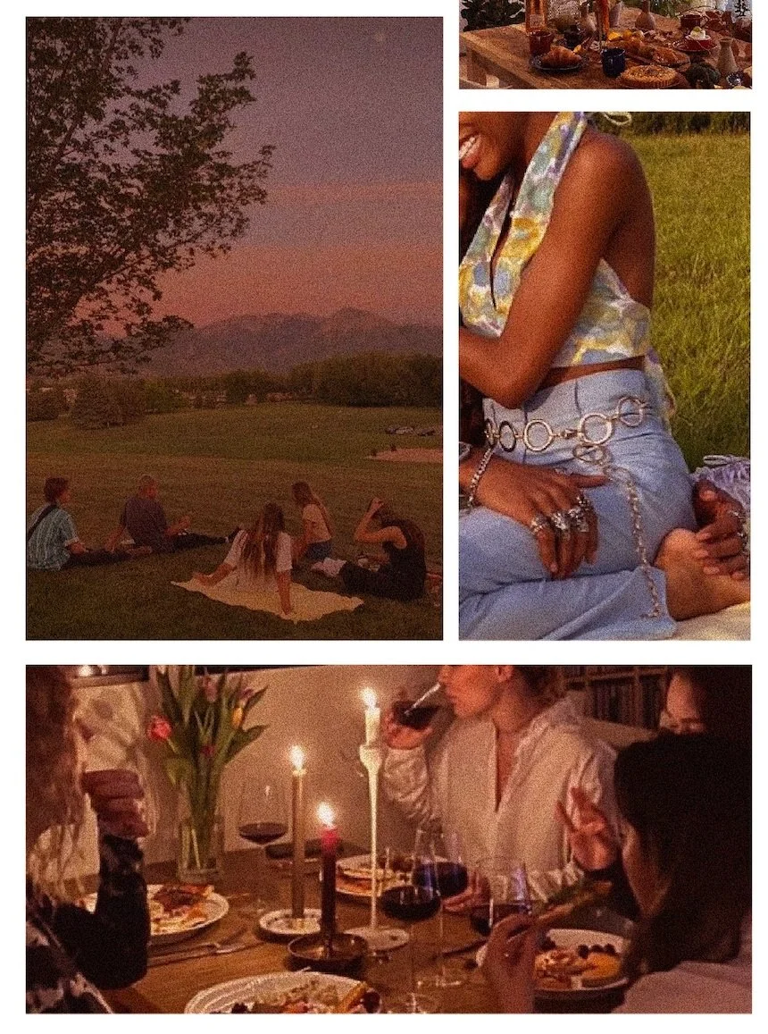
In my visual research I was inspired by the imagery from the women’s conciousness groups of the 1960’s as well as feminist zines from the 1980’s.
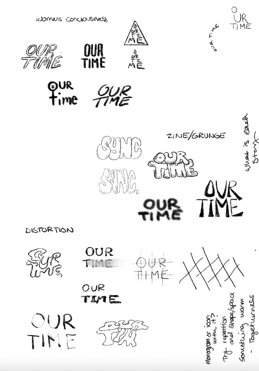
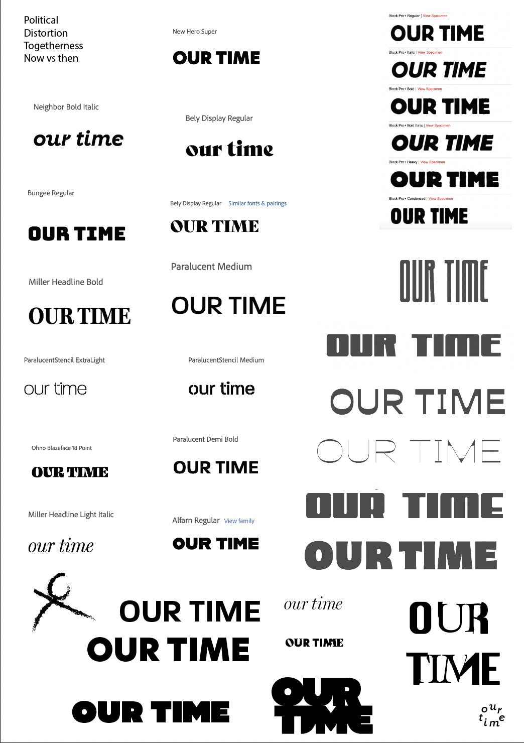
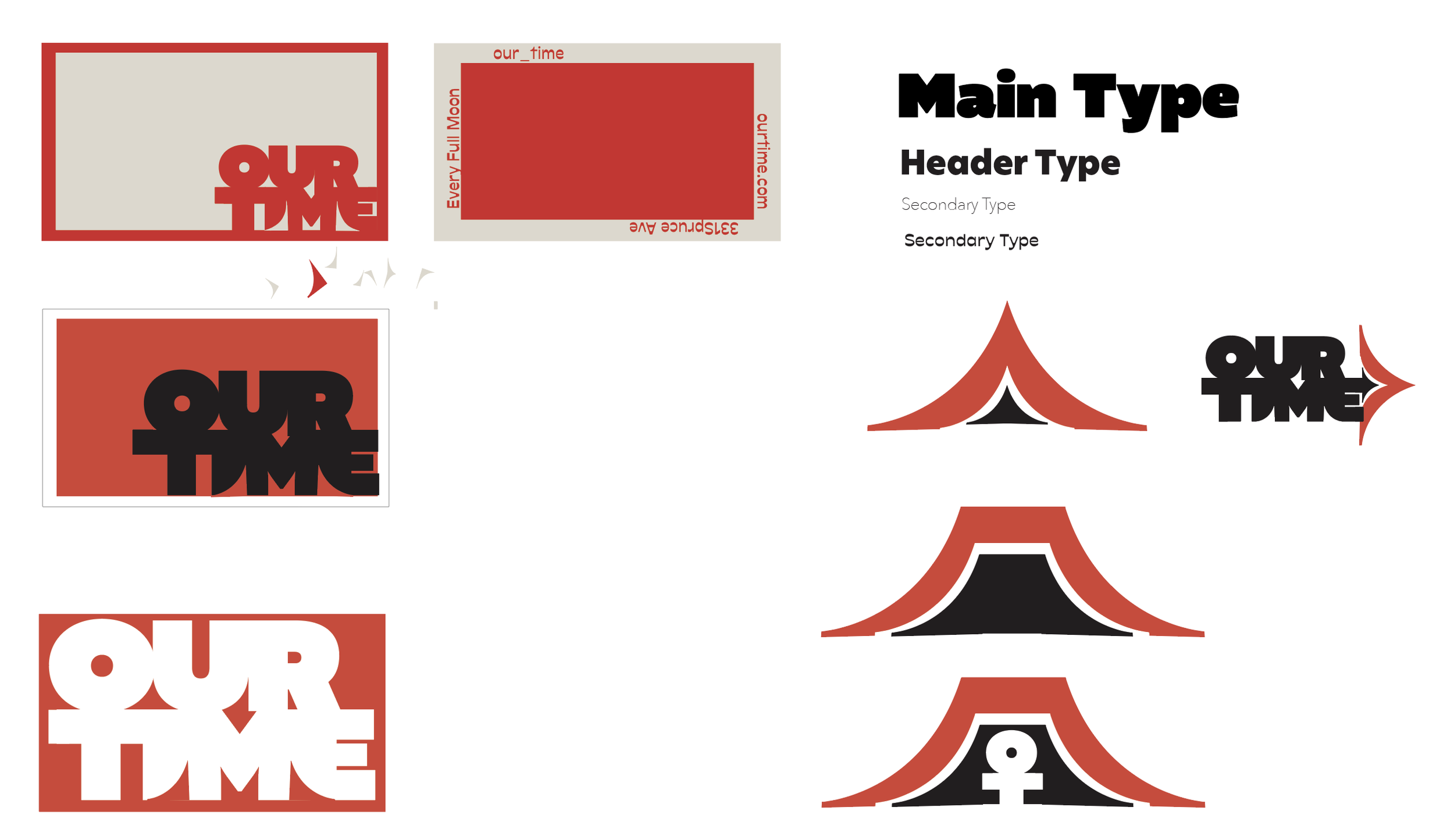
I did type research/exploration…
and then business card mockups…
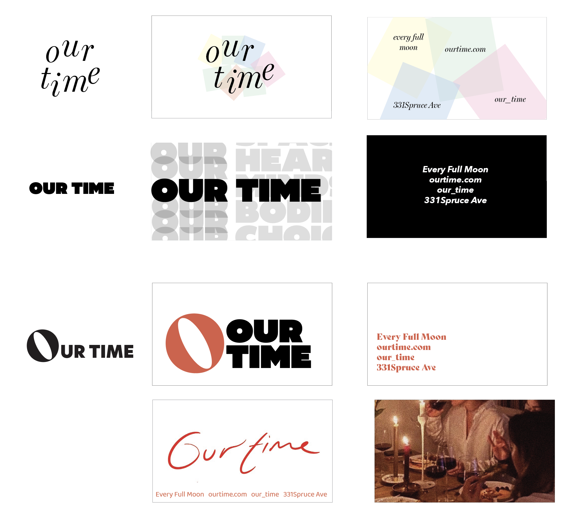
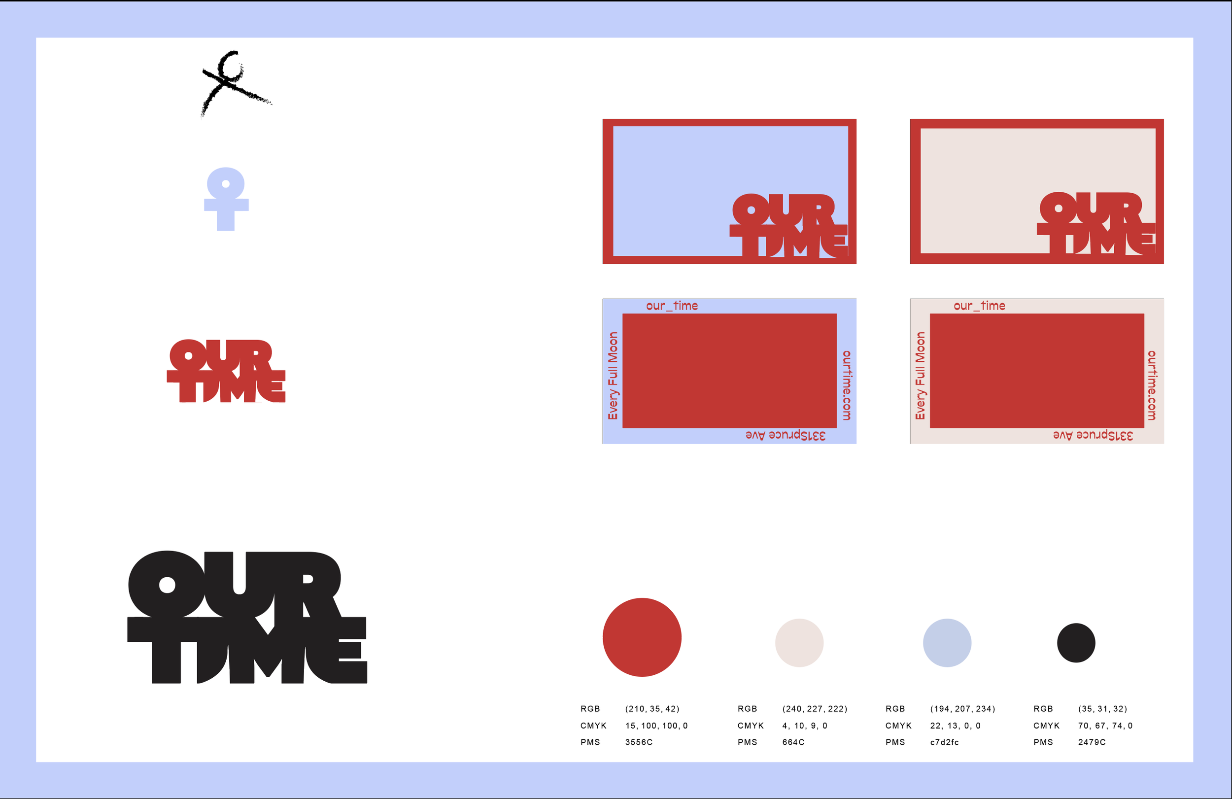
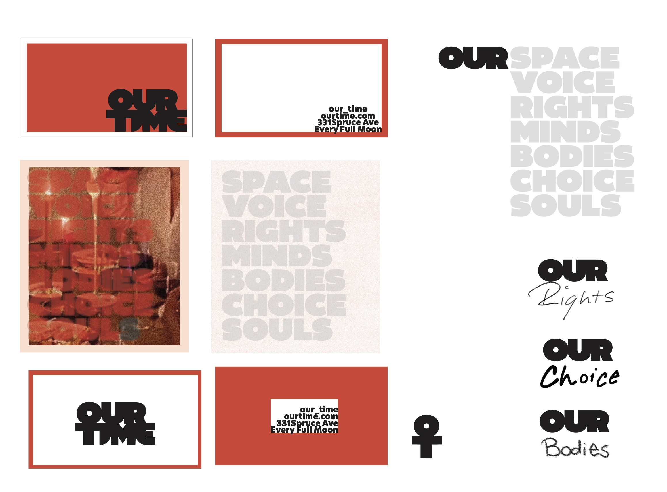
I honed in on a word mark. It felt strong and bold yet close-knit. I went with the word off to the side to reference the “make space, take space” mentality of many activist groups. The boarder is to reference coming together around a table, carpet, or common goal.
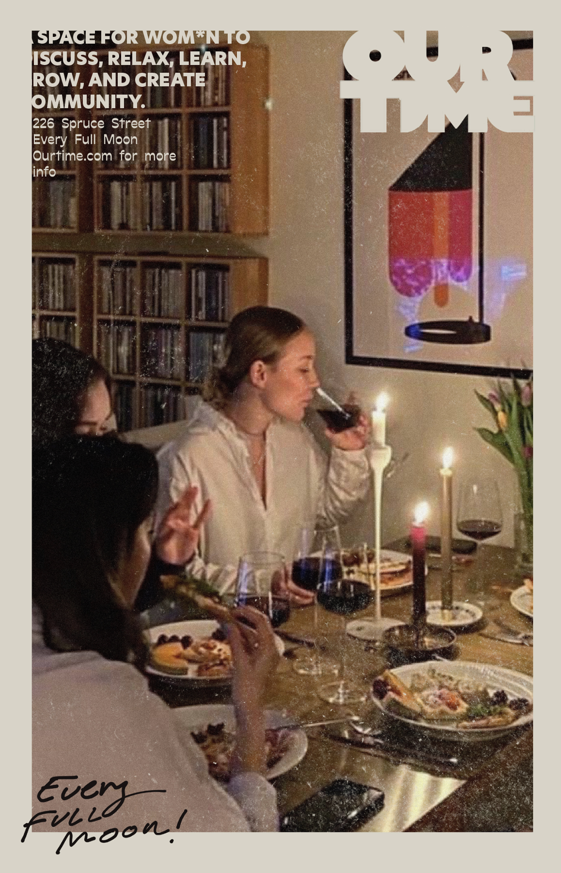
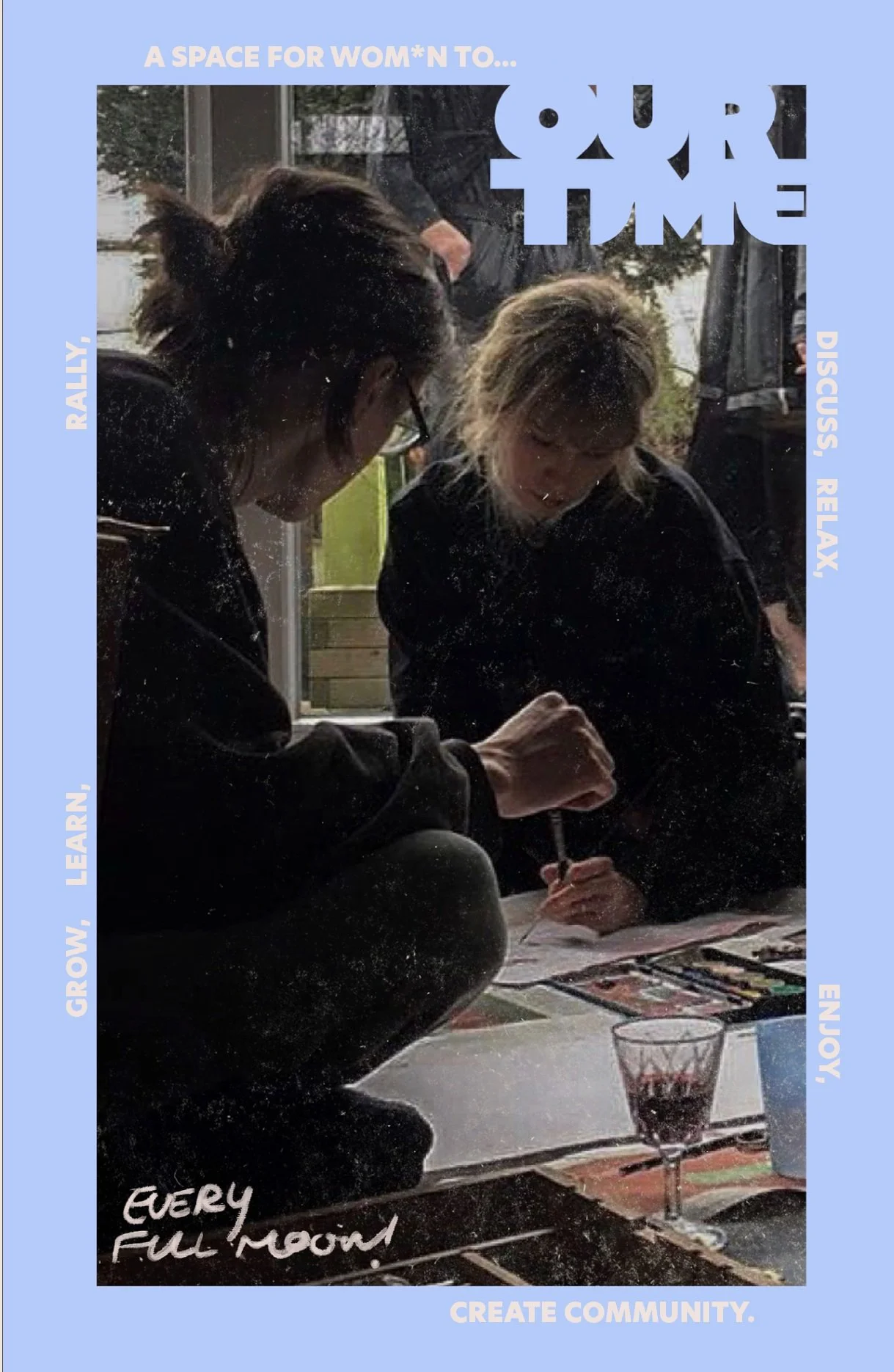
Color comps and image treatments:
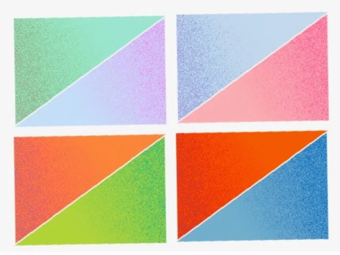
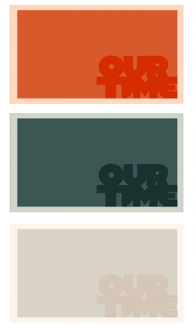
I wanted the colors to feel contemporary and the images to feel nostolgic. Having a sense of timelessness and that the womxn of yesterday are the womxn of today are the womxn of tomorrow.
Poster mockups:
The final system and design choices: